Pantone's Color(s) of the Year
As many of you know, I'm not one to obsess about trends. In fact, more often than not, if it were up to me, I'd choose not to follow them at all... especially when it comes to event design. That said, it's important for us to know what our clients are reading, seeing, and thinking, so we pay attention. Each year, Pantone announces their color of the year. Inevitably after that announcement, we start to notice that particular color featured prominently in product design, fashion, and much more. The wedding industry is no exception. For 2016, Pantone surprised us all by announcing that their color of the year was actually two colors: Rose Quartz and Serenity. Hello, pink and blue.

Not gonna lie... I don't love this pick. Even months later, I still don't love it. These two hues together make me think of a gender reveal baby shower. Alas, they are classics, and they're not going anywhere.
Here are three ways we've used them recently. I hope this inspires other non-lovers of Rose Quartz and Serenity out there!
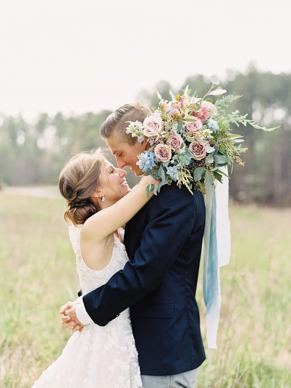
1.) Blooms! For this bouquet I combined soft pink roses with light blue delphinium and added soft blue silk ribbons on the wrap. [Image by Nancy Ray Photography | Hair/Makeup by Makeup for Your Day | Gown from BHLDN]
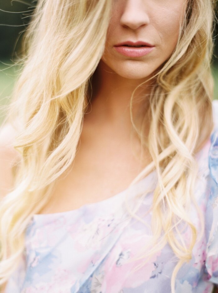
2. Pattern Play! This dress is from Plum Pretty Sugar's PPS Couture collection and the soft floral pattern combines both colors beautifully. [Styled for The Lively Workshop | Image by Perry Vaile | Hair/Makeup by Lindsey Regan Thorne]

3. When in doubt....blend the two and make mauve! This is a sneak peek from our recent destination wedding in Lake Tahoe (congrats Brittany and Lincoln!!!) where we used delightfully decadent mauve linens. [Image by Koby Brown of Archetype Studio | Linens from La Tavola]

And there you have it... three ways to make two ho-hum colors beautiful. Happy Friday, friends!
~Becca