The Pantone Color of the Year
Looking for design inspiration for your upcoming nuptials? Pantone - the leading authority on color - always provides us (+ our clients) with a handful of inspiring ideas of how to incorporate color into event design. Every year, color experts look into trend analysis within the entertainment, design, fashion, sports, lifestyle and travel industries to decide a single Color of the Year - and we have to say, the 2022 color of the year has us (lavender) dreaming.
This year’s color of the year is…
Very Peri
As you may or may not have gathered from its name, Very Peri, is a rich shade of periwinkle, while it’s still a member of the blue family, Very Peri’s red undertones shine through. The color itself is breathtaking, but the meaning behind it may be even more inspirational. Pantone chose this unique color to symbolize joy + creativity, with hopes of highlighting “the expansive possibilities that lay before us.” A message even more meaningful after two years of unknowns and postponements across the wedding industry.
Brides can incorporate this color into their day in a very simplistic way or go as far as choosing it for the main focal point. Over the past year, our clients have enjoyed shades of Very Peri for invitations, libations, bouquets, dresses, florals and menus. See some of the ways we included the color in our previous weddings:
FLORAL DESIGN
Whether it's the bride’s bouquet, the ceremony arch or bar-top arrangements, florals are often a seasonal way to incorporate color. The pops of Very Peri in these arrangements are subtle yet beautiful.

INVITATIONS
Leading up to the big day (and during), there will be paper goods all around. From the invitations to the menus and place cards, stationery is another simple yet creative way to incorporate the Color of the Year into your wedding. Seen here is a recent mock-up from our Graphic Designer, Allison.
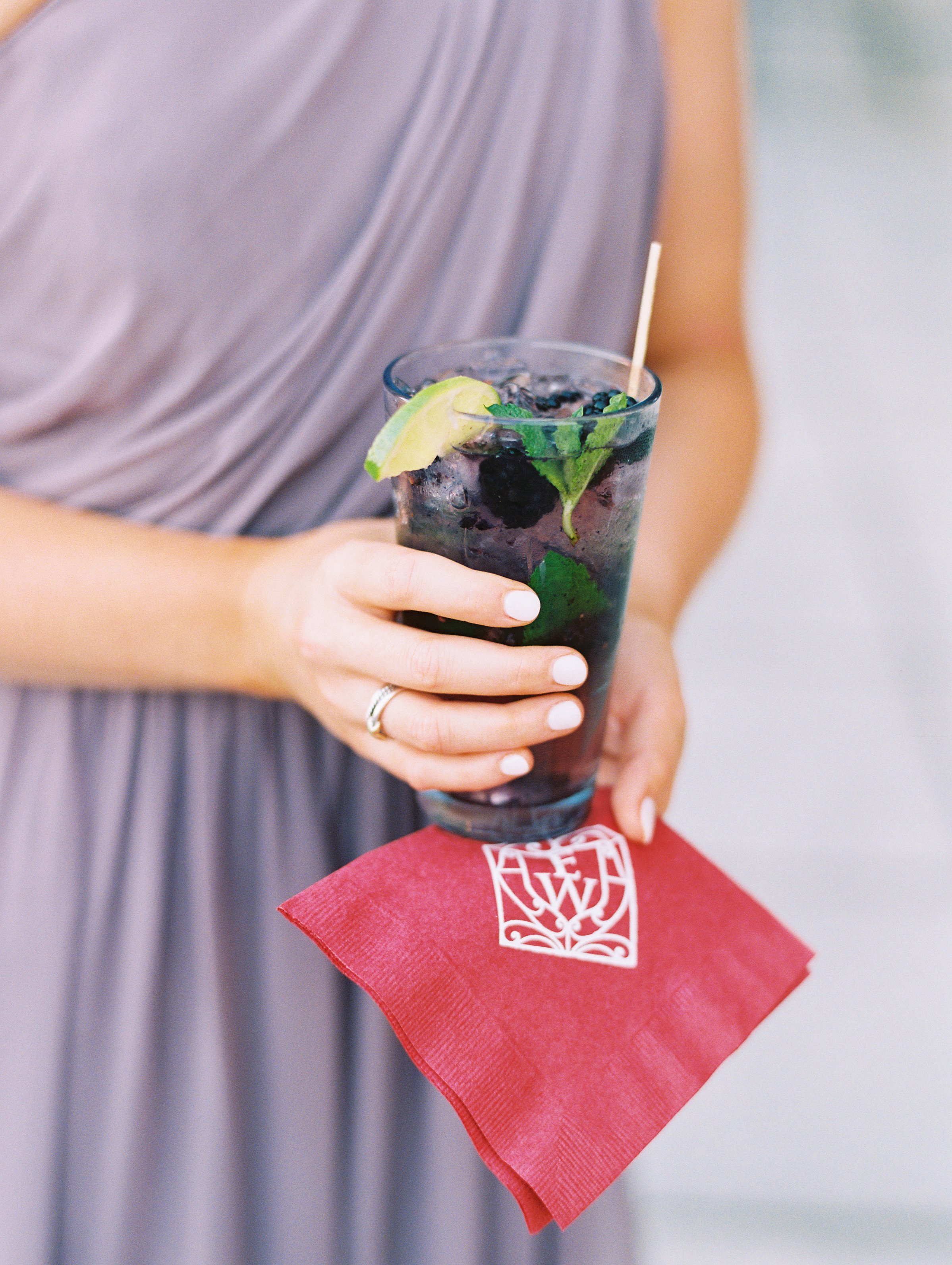
Speciality Cocktails
We always say it’s in the details! Wondering where you can add a pop of color? How about the drinks? ! The Color of the Year will look ultra refreshing as a delicious libation. It’s fun to brainstorm with catering companies and mixologists on ways to incorporate color; including syrups, ice cubes or garnishes. And of course, the glassware itself might even be the source of color.
We hope that this beautiful color leaves couples inspired, excited + hopeful for all that is to come. And if you’re not drawn to purple/periwinkle pigments, that’s perfectly okay too. There’s no color in the rainbow that we won’t embrace, and one of the hallmarks of our design approach is that it will always be grounded in what you love, regardless of trends. Ready to start planning your day? Drop us a line.