The Right Pop of Red

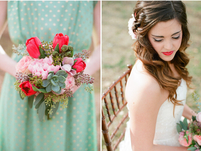
We work with so many color palettes on a day-to-day basis, but it never fails to amaze me when someone tells me they would never think to include the color red. I hear this from other industry creative types and clients alike. There are so many studies about the psychology connected with the color red. Red is often cited as the color of passion, energy, love and power. Many people feel agitated or angry if they experience too much exposure to the color. As with anything, I feel strongly that the key lies in moderation. Red is such a beautiful, vibrant color. It has the capacity to lift your spirits and make you smile almost instantly when it is used in the right way.
I'm sharing a few images below of a shoot we did with Nancy Ray a few years ago. The primary color palette was a minty green with gold and pink - but it was missing the right punch. Enter a little bit a red, in the form of tulips, raspberries and lipstick. The result was so much better.
View more of this shoot, originally featured on Wedding Chicks here. Enjoy!


Photography by Nancy Ray | Design and Styling by Rebecca Rose Events | Florals by Amy Lynne Originals | Wedding Gown by Christos, from Nitsa's Bridal Salon